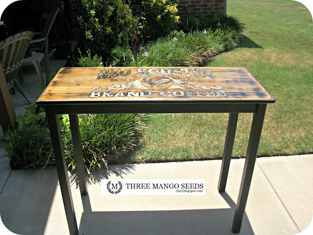
First off I have to say that this table was my husband's & youngest daugher's creation. I did very little here and was worried that the direction they were going wasn't going to be a popular one. I WAS WRONG! The idea they had turned out pretty spectacular and SOLD in two days! I won't be doubting them again.
Here is how it all went down... We started with this little plain jane table.
Gave it a few coats of black paint...
We all thought that the odd height made it unusable anywhere other than a kitchen. Perfect for a small kitchen island used for prepping. Keeping that in mind we came up with this for the top.
I love that she is wanting to learn, however we turned her loose with paint pens instead of brushes! Although, she surprised us with a pretty steady hand so maybe she'll do just fine with the brushes. LOL
Now, here's we were all started to have our own opinions. I thought we were done! A few more coats of sealer, tags and a stop at the shop! However, I was quickly outnumbered and this is what they decided it needed.
I guess they were right because it was gone FAST! They are pretty proud of themselves.

{UPDATE 10/2012} I don't use stencils because I like to enlarge or decrease images on a whim! However, you can buy a Red Rooster stencil here.


Looks like you have some competition! I love it both ways but I see why it sold so quickly.
ReplyDeleteFran
I think you have a designer in the making and I'm definitely voting for the finished version. Wowza, that's a cool piece. I would have snapped it up as well!
ReplyDeletefab both ways really. I am rather partial to the heavily distressed version though :-)
ReplyDeleteCheers, Gee
i love both versions, it turned out so cool, love it!
ReplyDeleteSometimes just saying I love something doesn't express how much I freaking love something. Like this table. Gets my TDC award, too darn cute and I'm pinning it.
ReplyDelete~Bliss~
OMGoodness your daughter and hubby did an awesome job on this make-over...I LOVE it!! I've pinned it because it's so darn cute!!! Enjoy your day, Gail
ReplyDeleteIt certainly catches your eye right off the bat;)!! We are building and I have NO brown wood, so my choice goes to the black. HOWEVER, if somebody showed up at the door with the more woody version, I would definitely find a spot for it. Masterpieces both:) What a talented family you are.
ReplyDeleteWOW!!!! You have an amazing hubby and daughter, I'd say!!! LOVE IT!!!! My son is always wanting to do furniture... but he's only 6 and errr... I let him roll paint on. sometimes. :)
ReplyDeleteI first liked it distressed but after seeing it black, I kinda liked that version a bit more. However, both are awesome. Did you use a big stencil? Such a neat graphic. And what type of black paint was used on the table?
ReplyDeleteBoth versions are great - but I think hubby and daughter made the right call on this one, lol
ReplyDeleteBeautiful makeover either way!!!
Actually I liked your version best, but then....nothing I try to sell goes very fast. What does THAT tell you.
ReplyDeleteIncredible makeover! Love them both!
ReplyDeleteOh no! You have been outnumbered. I think I would be somewhere in between ;) It sure turned out awesome. Loved the graphic!!!!
ReplyDeleteWOW! that is amazing! you continue to wow me with your talent!
ReplyDeleteLove this graphic and transformation. I am not surprised that it sold so quickly. I really like it both ways as well. Hard to choose.
ReplyDeleteI just saw your blog threw diy sweet home. I really loved the table that your daughter and husband did. The theme threw out my home is chickens and rooster with the old farm house feel. I have a perfect table to do the design that they did. Can you tell me where they got the design or how they got it that big?
ReplyDeletedeana
love it--thanks so much for linking up!
ReplyDeleteI would love to know how you did this becasue I have no idea how you distressed this and I would love to learn. It looks great both ways and I think either one would have sold in 2 days !
ReplyDeleteKim@reposhture.blogspot.com
They did an amazing job - love it! I hope you'll drop by and share this at Knick of Time Tuesday - the party is still going on!
ReplyDeleteBlessings,
Angie @ Knick of Time
Oh. My. GOodness. I'm in love. How did you take the black off where the letters are now? It looked like you had painted the entire table black first?
ReplyDeleteDana {craftedniche.com}
I really love this table. I like the brown one. can you let me know how you got this look.
ReplyDelete